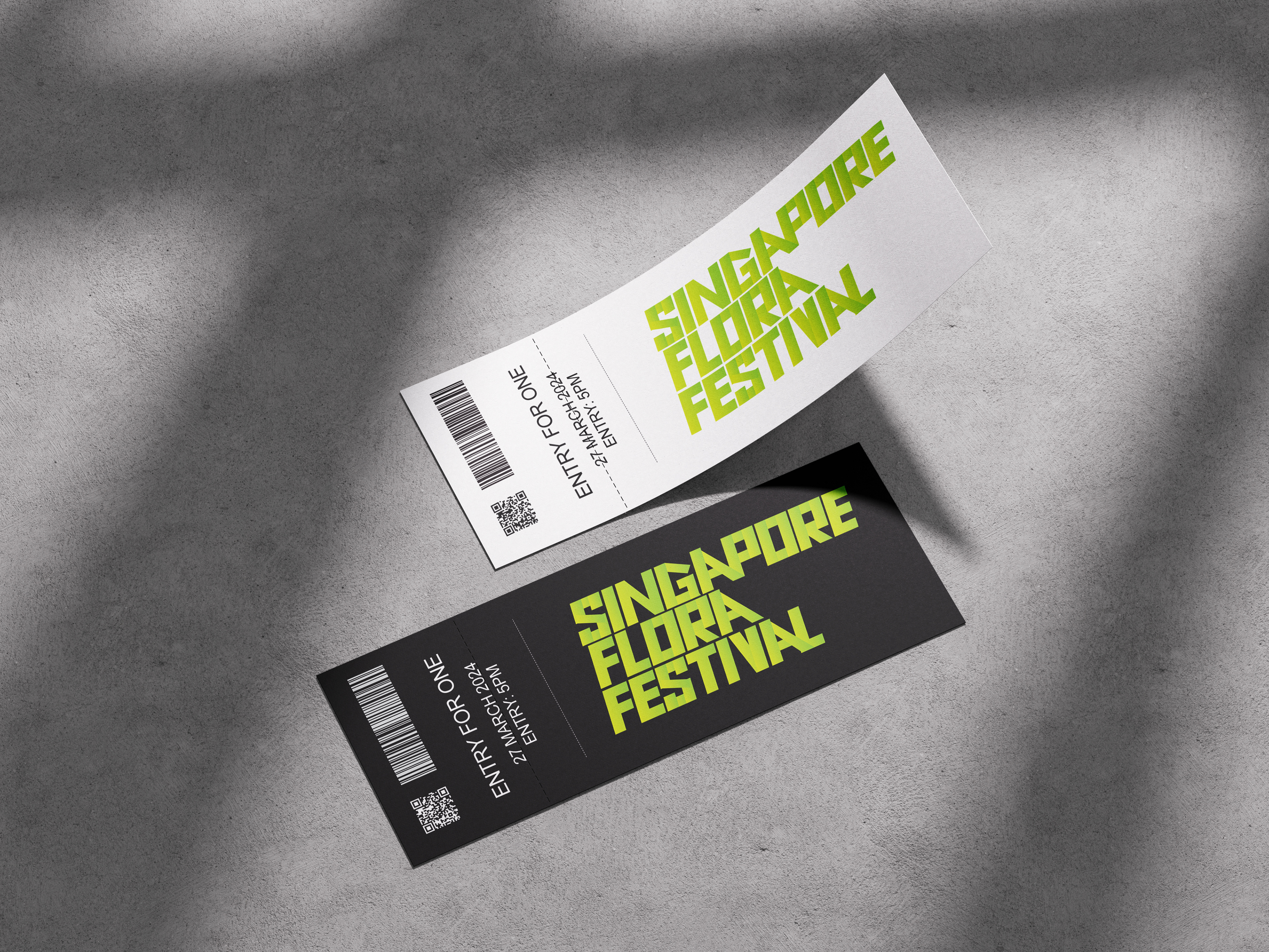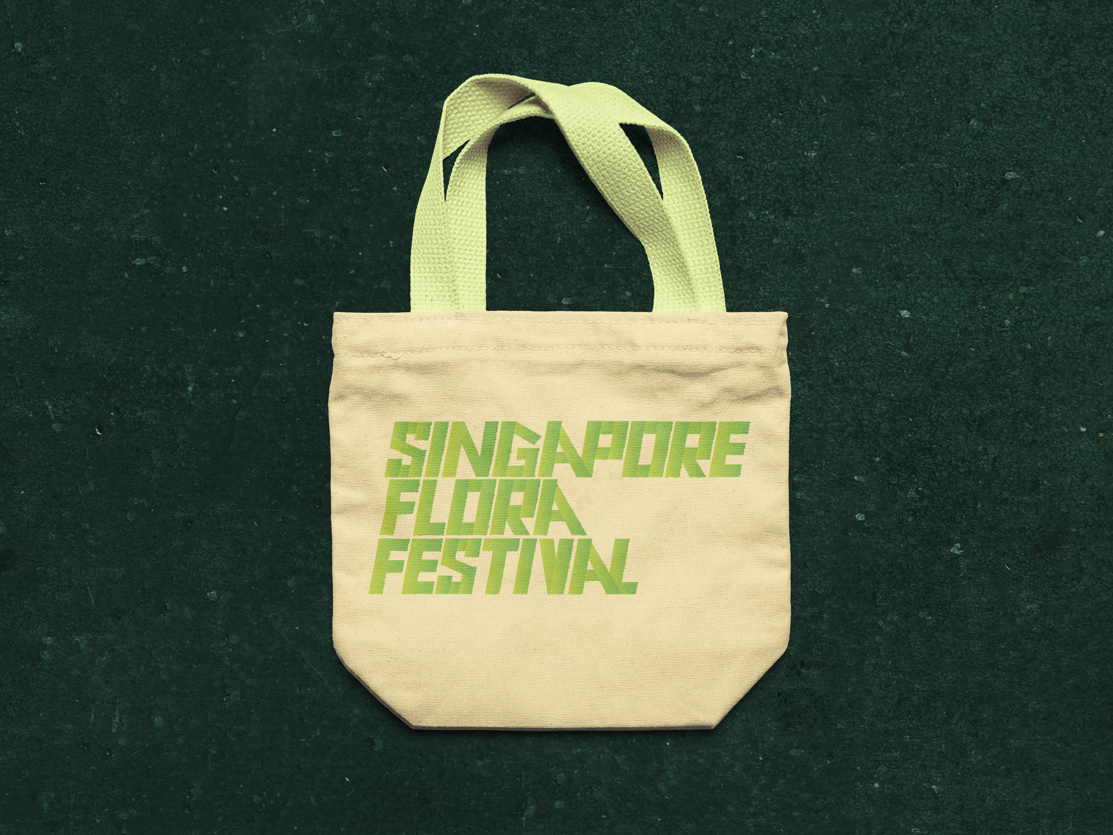


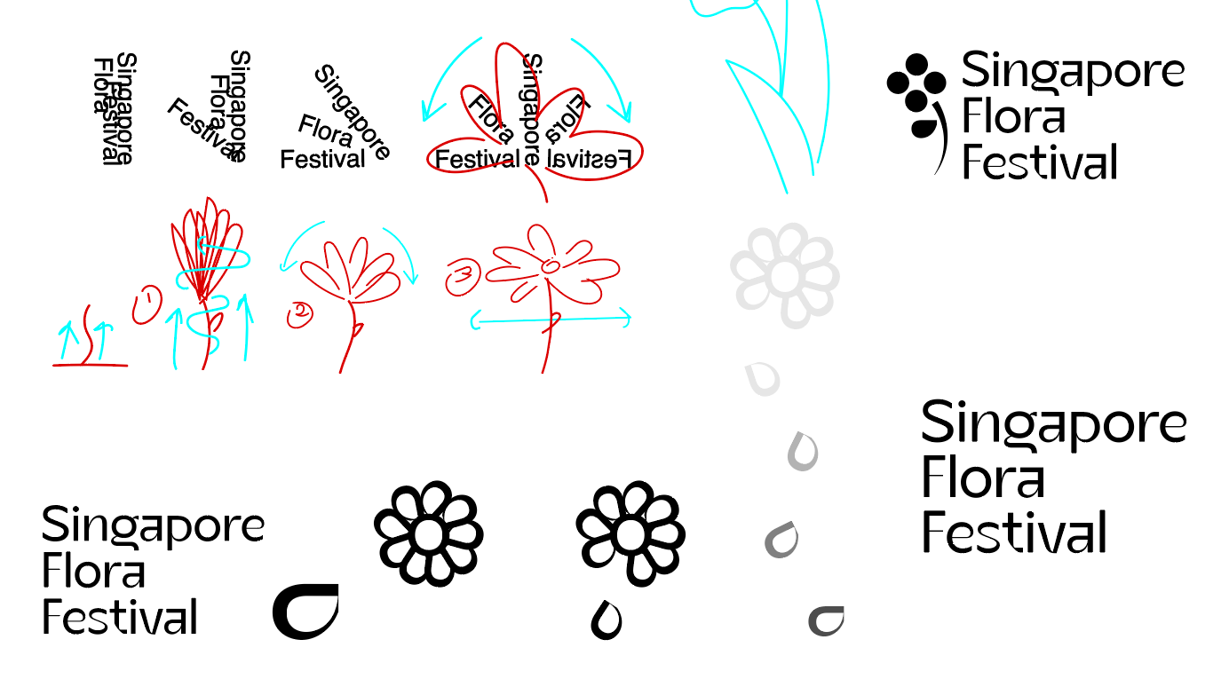
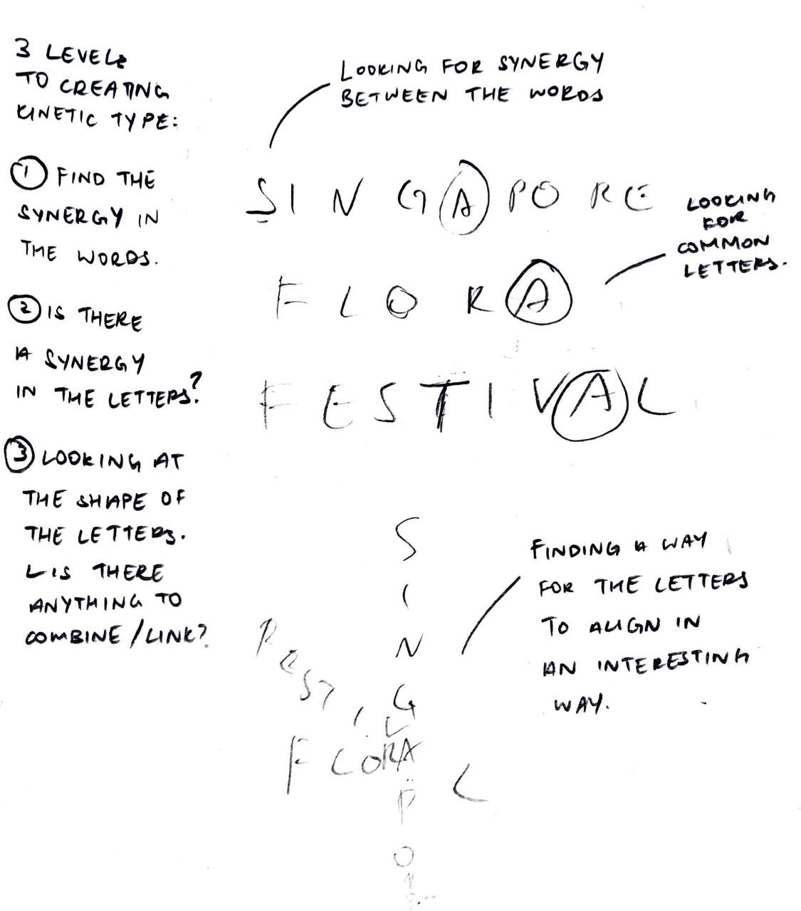
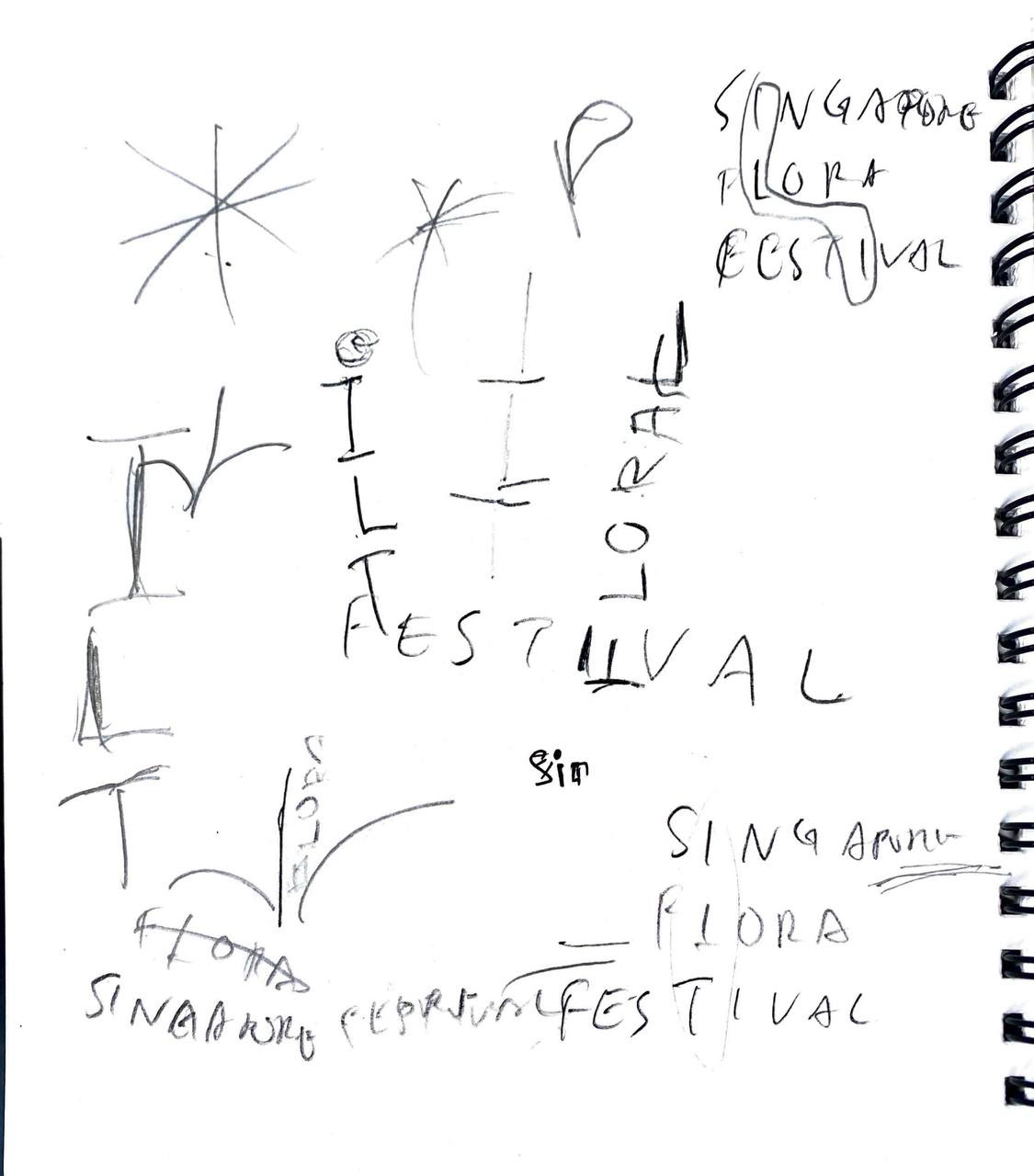
From the start of this project, my vision was to craft a blooming motion that embodied the essence of flora—a concept emblematic of growth and vitality. This vision pushed me through numerous iterations and sketches as I explored various approaches to achieve this effect using only typography. Each iteration was a step forward, refining and honing the concept until it resonated harmoniously with the overarching theme.

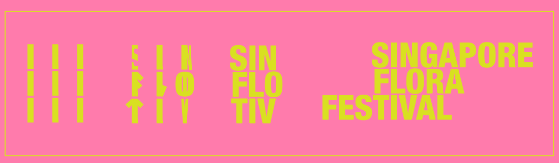
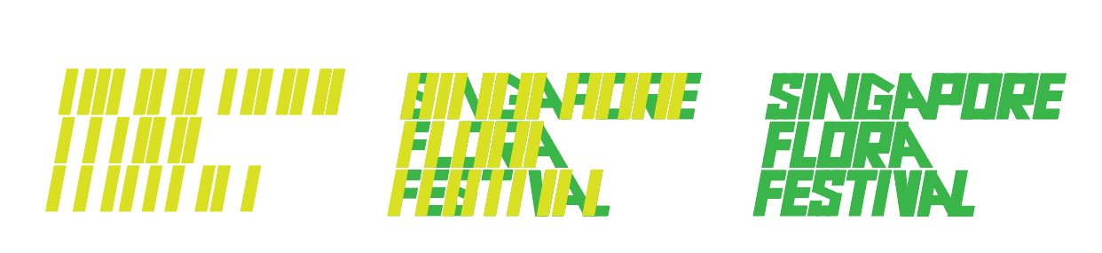
As I progressed, I honed in on a concept that aimed to convey a blooming outward motion by altering the letters. Although the letters lacked uniformity, I was determined to overcome this challenge and achieve the desired effect. Through perseverance, I discovered a compromise and developed a custom modular font that ensured the success of my envisioned concept
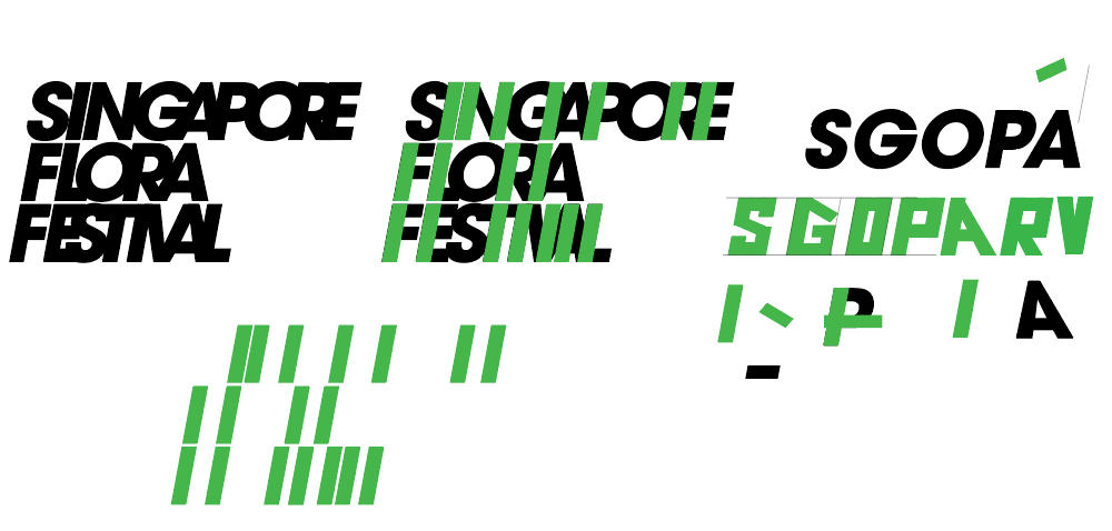
I took the Avant Garde Gothic font and made some significant changes to it. My aim was to give each rounded letter a unique "stem" like that of a plant. By inclining certain letters such as A and G, I added some personality and made them look less boxy. The end result was a simple yet clean typeface that strongly resembled plant stems. From there, i easily replicated the blooming effect I had envisioned from the start.
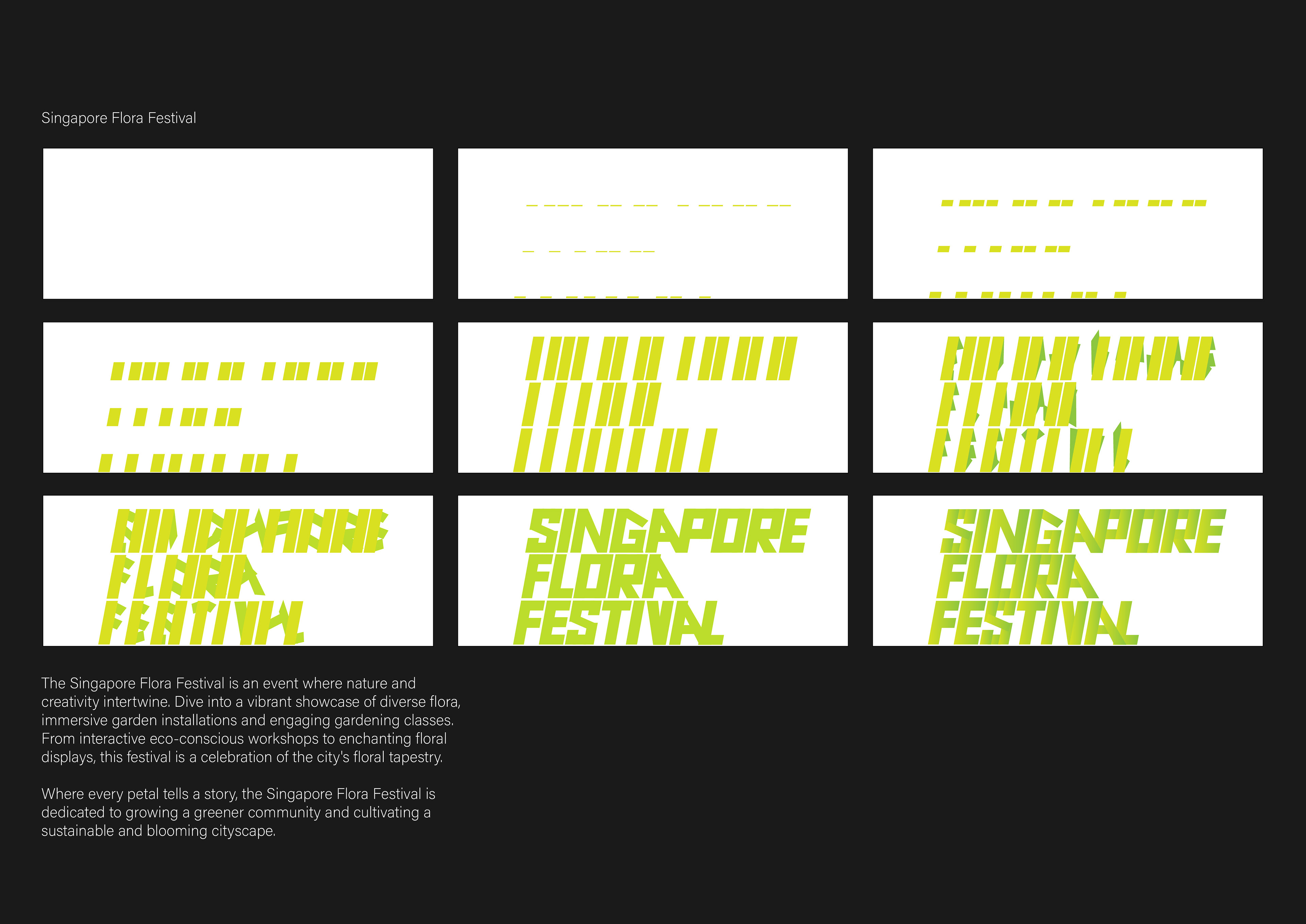
Storyboard of Final Animation

The animation's final version effectively achieved an intended stop-motion effect, resembling a video timelapse of a plant's growth.